In the first lesson of this series, I showed you a quick and easy way to make professional-looking images in a post called The Beginner’s Guide to Making Graphics WITHOUT Photoshop. I recommend taking a look at it before starting this lesson if you haven’t already.
In this lesson, I’m focusing on creating a logo for your course, or online project.
Why worry about the course logo?
This one image is the “first impression” your learners get about the content of the course and who is teaching it. Sadly, most course logos look like a generic stock photo with the course name typed above it and miss the opportunity to engage the learner, state the main idea of the course, create a professional, coherent design and connect to the teacher.
Yes, the logo of the course can do ALL these things.
Let’s get started.
A Course Logo Template
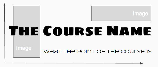
In the first lesson, I demo’d how to arrange images and text on a Google Slide and then turn it into an image for your course. In the template below, I’m starting with another simple design arrangement for you to copy or use as a starting point.

Notice that the main logo font is heavy, subtitle is not. Contrast is so important when trying to add visual interest. Heavy and light. Regular and All Capped. The image placeholders are just suggestions, and you can see I play with different arrangements in the logos I created below.
Here are some logo ideas and my thoughts on how they might get used in a course.
Example #1:
Tying the Logo to the Rest of the Course
The Breakdown:
The above logo uses Google fonts Bangers and Shadows into Light. I chose a handwritten font for the subtitle to emphasize “personal”. The brain graphic also looks “sketched” so there is a common theme building already. I could find some colorful swirls like in the brain image and use that to break up text blocks. I would continue to use doodles and scribbles throughout the course, as if it was a notebook being written in. I could use the handwritten font as little notes for my learners throughout the course. The unit headings in the course would be similar, but smaller. It might look something like this:
Course Fonts: Bangers (main), Shadows into Light (playful subtitles)
Image ideas: sketches, doodles, journal entry, arrows, swirls, sticky notes, pencil crayons .. etc …
Example #2:
Using a Logo to Gamify the Course
The Breakdown:
I chose a main font called Horseshoes and Lemonade. The look suggests the old “Game of Life” board game from the 60’s which I could use to gamify throughout the course. The rewards (badges, etc) they earn could be everything from a new car to a bump in salary. They could have to “avoid” the safety problems embedded throughout the course, whether by passing tests or collecting the WHMIS symbols (by clicking on them). It’s a nice tie-in to the point of the course which is prepping for a first job. The pretend road signs are fun and could be used in many ways throughout the course.
Here is my step-by-step guide on How to Start Gamifying Your Online Course.
Course Fonts: Horseshoes and Lemonade (main)
Image ideas: Road signs, 60’s retro game board stuff, tools, WHMIS safety symbols … etc …
Example #3:
Using a Photograph as a Logo
The Breakdown:
Careful with photos. I almost never use them as course logos, though I know they are probably the most popular choice in online courses. I find them tougher to play off of for the rest of the course, and a single great photo is hard to find. Also, photos that are stunning when large on your monitor can sometimes lose their impact on smaller screens and mobile.
All that said, photos can be really powerful:
 Source: Pexels
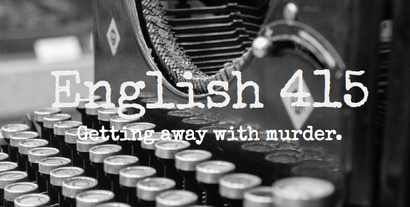
The final version of the “English 415” logo just SCREAMS … This is gonna be interesting, hold on tight.
Imagine the clever ways you could carry the look you created all though the course. The “typed” google font (called Special Elite) could be a note from a killer. Or a police report. Or a reading excerpt from a novel. Old newspapers could be used. Vintage crime scene photos would match the retro typewriter. And the red “murder”? … Imagine all the ways you could now use the color red in the course. Endless fun and major impact with your learners.
Here are some design tips for photos:
– Choose a simple, clear photo with a close up on the subject
– Remember the “rule of thirds” (subject or focus off to the side creates more interest)
– Try slicing up (use the screenshot tool) and reusing the photo in different ways later in the course
– Use a transparent layer under the course heading so your text can be read easier.
How to Make a Transparent Layer: When you write on a photo, you need a transparent layer underneath or the writing is too hard to read. Choose a color that contrasts the font. You create this layer in Google Slides by inserting an (empty) text box, then use the “fill” tool and choose “custom”. Once you’ve made it transparent, you right click and send it back behind the text.
And Finally …
I wanted to end this lesson with some sites for you to grab beautiful, copyright safe images. My favorite go-to places are unsplash (free), pixabay (free), and 123rf (purchase credits for images).
I hope you have fun creating some new course logos. Use them to help set up the rest of the images in your courses. Drop me a note below if you have any questions I can help with, and don’t forget to follow me on Twitter.
Next lesson … How to start gamifying your online course!


Leave A Comment