If there is one thing everyone agrees on, it’s how awful that PowerPoint presentation was they just sat through. With PowerPoint installed on over 1 billion machines around the world and 350 presentations being given every second, lousy presentations are a massive problem.
Fortunately, there is a ton of great PowerPoint advice by elearning and design gurus. I’ve compiled tips from the very best.
1. Don’t stretch your images
One mistake that is almost universal is stretching an image to get it bigger. The result is an annoying pixelated image.
Notice that even the slightest bit of stretching starts pixelating the checkmark?
Small images cannot be made bigger AND remain clear.
One problem with images we find online is that they are an assortment of sizes and quality. MOST online images are designed to be smaller and lower quality so that they load faster online.
When you copy and paste one of these smaller, low resolution images on to a PowerPoint slide, you are lucky if the original is clear, never mind stretching it even bigger. There just aren’t enough pixels to keep it clear, the bigger and bigger it gets.
-
Pro Advice:
Instead of starting with a small image and stretching it, do the reverse. Start with the original high resolution image (or get one) and then shrink it. Notice in my example that shrinking the checkmark doesn’t affect the quality, only stretching it bigger.
Bluewave Design also suggests checking that your PPT file isn’t compressing images and lowering their quality. PowerPoint tries to keep your file size down by further reducing the quality of your images. You may need to turn compression “off” for each presentation if you are still getting blurry images.
2. Get rid of dated clipart
Images have a lifespan. Like all designs they need to be updated and kept current.
Using high quality photographs like those at 123rf.com, Pixabay, or Unsplash is preferable to clipart, unless you are in education where scenarios and illustrations are important. Our brains respond to faces more strongly than abstract photos, so keep that in mind when choosing images.
-
Pro Advice:
The first place to start is with the word “clipart” itself. This outdated term refers to a type of cheap, low res graphic that was popular before online images became more sophisticated and easy to create. As Rapid Elearning points out the term to start using is free vector illustration:
 Photo from Rapid Elearning
For more advanced designers, take a peek at hot graphic design trends from the Elearning Brothers and learn more about flat design, minimalism and sketchnoting.
3. Don’t use the slides as your handout
It seems so simple. We all know that pages of bulleted information make your audience glassy-eyed. So why are so many presentation still like this?
Because the designer has turned a presentation tool into a giant handout.
-
Pro Advice:
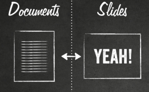
Think of slides as “billboards” with big text and simple design. Understand that presentations are not content delivery vehicles. They are for sharing ideas, broad strokes, and breadcrumbs to other resources. Eugene Cheng‘s slide above says it all, Don’t project your documents.
If you NEED to deliver more content in your PowerPoint (such as with elearning) split content into smaller chunks and diversify the way you present it. Use videos, audio, screencasting and infographics in addition to the text.
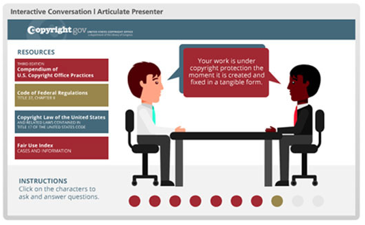
There are lots of interesting PowerPoint design ideas at Elearning Heroes. Like this conversation template (free):
4. Create a visual hierarchy
Great design is about leading the eyes to the most important parts of a slide. When text and pictures are all the same colour and size there is nothing helping the brain value and organize material.
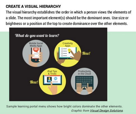
Photo from theelearningcoaching.com
-
Pro Advice:
Connie Malamed (The Elearning Coach) has a great slideshow with ideas from her book Visual Design Solutions. This slide (shown above) demonstrates how to create a visual “hierarchy” with color (bright yellow), size (larger text) and shape.
You can also do this with photographs. Contrast colour photos with black and white, or crop just the focal point for a more close-up, dramatic shot.
5. Give your fonts some character
Are you stuck using default fonts like Arial and Times New Roman for your slides? Time to break out of the rut.
Text can communicate mood, key ideas and symbolic meaning. Even simple fonts can be improved with size and color.
-
Pro Advice:
Damon Nofar (green images above) has a great set of tips on Typography: Play with different fonts, and use size, contrast, and spacing to give a dramatic effect on your design. Turning titles into jpg’s will guarantee that they won’t go wonky if your PowerPoint is played on another device without those cool fonts installed.
Just remember:
 For great fonts like the one above, check out dafont.com or font squirrel. Just be sure and use clean, easy-to-read sans serif fonts for the main text in your slides.
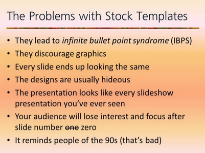
6. Stock Templates. Ew.
 Slide from visuali.se
-
Pro Advice:
Make your own designs, suggests Edahn Small, with color, fonts and a unique layout. You can reuse the designs in other presentations, creating your own bank of original slides.
7. Choose a modern color scheme
One major red flag for an amateur looking PowerPoint is dated, mismatched color combinations.
If you wouldn’t decorate your home those colors, they shouldn’t be in your presentation.
This also applies to your online course as well.
 From Color Scheme Designer
-
Pro Advice:
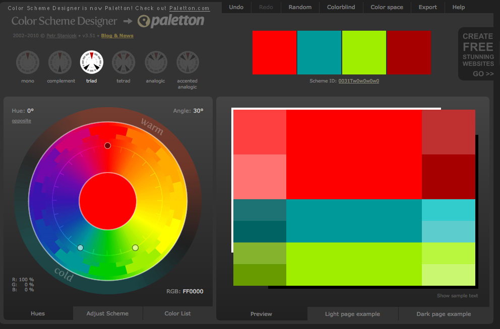
Think of colors as being part of a family or “palette” just like the interior design of a home. Try places like Colour Lovers and Color Scheme Designer to help select eye catching color schemes.
8. Use “The Rule of Thirds”
One trick that photographers (and designers) use is to divide images into thirds for greater impact.

Photo from webdesignerdepot.com
“The idea is that placement along a third makes everything off-center, which creates visual interest. Centered content (text or images) tends to feel really balanced and formal (by that I mean really boring).” (Stephanie Evergreen)
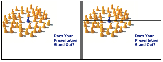
Photo from sixminutes.dlugan.com
This works the same in PowerPoint with important content positioned along the thirds on each slide. This article will help you set up your slide with guides to show the thirds.
9. Tell Your Story
My final advice from the pros is this. The biggest PowerPoint design feature you can add is to tell a story. Not some cute anecdote at the beginning of your slideshow but rather think of the entire presentation as a story.
Why stories?
Everything, no matter what subject area, has a story. And it’s stories that keep our attention, not information.
Find the story.
Nancy Duarte’s book, Resonate: Visual Stories that Transform Audiences was a game changer for me. I learned to rethink my slides, and why I was doing the PowerPoint in the first place.
[Tweet “If you are doing a presentation just to deliver content, no wonder it’s boring.”]
What’s the real reason? Why is this information important?
What is the struggle being overcome? How is your audience part of this?
Solving problems is why we do presentations.
-
Pro Advice:
Check out these 25 Fantastic PowerPoint Presentations and notice the way they tell a story by presenting the problem and engaging the audience with how to make it better.
The Takeaway
To recap, here are the most important tips for a stunning PowerPoint design:
1. Don’t stretch your images
2. Get rid of dated clipart
3. Don’t use the slides as your handout
4. Create a visual hierarchy
5. Give your fonts some character
6. Stock templates. Ew.
7. Choose a modern colour scheme
8. Use “The Rule of Thirds”
9. Tell your story
I hope you can use these ideas to create your own powerful, visually-engaging presentations.
Any comments or questions about the tips in this article? Leave a comment below! I’d love to hear from you.




This article came in great timing! Myself and my team of nurse educators have the task of updating some very text heavy and clumsy looking PowerPoints. Your tips are dead on and your resources will save us hours of trying to find the best image or template for our presentation. I think the tip that really stuck with me is “Tell Your Story”…to engage the audience through personal experiences to exemplify the points (We even bought the book you suggested for our department “Resonate: Visual Stories that Transform Audiences”). Thanks!!
Glad you found it helpful, Jane. Thanks again for your ideas while I was writing it! 🙂
It seems to me that the design of our PowerPoints is never a topic of discussion in organizations. They are so critical for learning and yet so often overlooked. You are going to love her book. Thanks for the note.